THESIS PROJECT
The Problem
The Sin City Stingers aim to address the challenge of building a loyal fan base by fostering a strong sense of community and belonging, thereby fulfilling the audience’s need for affiliation through shared experiences. This method enhances engagement, transforming casual viewers into passionate supporters.
The Solution
This section will detail the development of the Sin City Stingers from conception to completion.
Onlyness Statement
First Draft
The first draft of the onlyness statement focused on hitting the key elements of the brand. In the early stages, the scorpion mascot was conceived and included in the statement because no other ECHL team had a mascot like it. The goal was to be passionate about attending the games, winning, and being in a community.
Final Version
The onlyness statement was revised because the original did not emphasize solving the problem of affiliation.
The first draft focused more on passion and energy instead of building community. In the revised and final version, it feels more welcoming and community-oriented. The team is introduced by stating who they are, where they are, and what they do. The connection between the fans and players is prioritized.
First Draft
The Sin City Stingers are the only ECHL team that brings the strength and unity of a scorpion to life, capturing the raw energy of Las Vegas through passion, resilience, and a nonstop drive to win. We’re not just a team, we’re a community that believes in the power of coming together to achieve something great. Every game, our fans and players feed off each other, pushing for success both on and off the ice. We play with heart, compete with grit, and stand strong as one unbeatable force.
Final Version
The Sin City Stingers are more than an ECHL team; they unite the Las Vegas community. With a welcoming atmosphere, they create strong connections between fans and players, transforming each game into a celebration of city pride. The Stingers build a lasting community grounded in strength, passion, and shared victories by nurturing genuine bonds with their fans.
Voice & Tone
Brand Personality
The brand personality was figured out by listing what the Sin City Stingers are and aren't.
The original Brand Personality:
The Sin City Stingers are passionate.
The Sin City Stingers are strong.
The Sin City Stingers are team players.
The Sin City Stingers aren't selfish.
The Sin City Stingers aren't disconnected.
The Sin City Stingers aren't one-dimensional.
The original brand personality was not focused on the needs of the consumers. The personality needs to be understood and consistent with other brand elements; otherwise, the tone and style of the communication change. Schroeder has a practice in their article that suggests defining the brand in three words, such as "Educational, but not bizarre." Applying this method to the Sin City Stingers made it easier to figure out the team's personality. It is also suggested to define what this means within the brand (Schroeder, 2019).
The new brand personality list:
The Sin City Stingers are inclusive; they aren't complacent.
The Sin City Stingers are authentic; they aren't dull.
The Sin City Stingers are team players; they aren't disconnected.
Using Schroeder's advice, of defining what it means within the brand: By stating that the Stingers are inclusive and not complacent, it means that the Stingers are focused on being as inclusive as possible in building the community and will not be complacent or lazy when it comes to managing that inclusiveness and including everyone.
Stating that they are authentic and not dull, the Stingers will stay true to themselves and never dim the light of the team. They strive to stick to their morals, values, and goals and never stray away.
Finally, stating that the Stingers are team players and are not disconnected means that the team strives to ensure that it is focused on succeeding together as a team, but also within the community. They are not disconnected from the fans. The Stingers aim to succeed in collaboration with the community.
Brand Values
From the get-go, the Sin City Stingers focused heavily on community. The three terms most associated with the brands are:
Unity, Community, and Victory.
By identifying the core values that define the brand, it will serve as the foundation for the brand's voice. This helps guide the messaging in terms of what your brand is about and what it stands for (Prpic, 2024).
Narrowing down the brand values also helped identify the target audience. Initially, the target audience was too broad, encompassing almost everyone. By understanding what the brand stood for, it was easier to determine who the Stingers wanted their consumers to be.
Target Audience
The original target audience was:
Children, young adults, and middle-aged passionate sports fans who are community-oriented, loyal, and looking for an affordable entertainment option.
This target audience was not ideal because it was too broad. It's almost impossible to design for everyone in mind. Narrowing down the audience makes everything more focused, profitable, and effective. (Faustino, 2025).
The new target audience is:
Sports fans who are:
Community-oriented - The fans want to support their community and team they love with like-minded people. Entertainment - New and old fans will be watching an entertaining sport. Belonging - Hockey is for everyone, so everyone will feel a sense of belonging.
Brand Voice
The Stingers focus on unity, community, and victory. The brand voice for them will embody those values, as this is the overall brand identity that encompasses their entire communications.
To focus on unity, the brand voice should incorporate action words that convey feelings of unity, such as togetherness and collaboration.
The brand voice should aim to be:
Friendly, approachable, warm, and welcoming. This covers the community value.
For victory, empowering, bold, and fearless-driven words should be used.
By understanding the characteristics that define the brand voice, it's easier to adjust the tone later based on the situation. The brand still remains consistent because the voice is figured out.
Brand Name
When brainstorming for a team name, research was conducted on other ECHL team names by browsing the website.
The majority of the teams featured the city name followed by a type of mascot, typically an animal. This helps establish roots within the city for that team (Barron, 2019).
Choosing a mascot proved to be a bit more challenging. During this stage, it was decided to shift away from the Vegas Strip and towards the canyons that Las Vegas had to offer. It was an effective way to set itself apart from other teams that concentrated on what the big city could provide.
Now that a location was set, further research was conducted to determine what animals lived in the Vegas deserts.
Bark Scorpions were commonly found in Las Vegas (12 deadliest, 2024). This was chosen to be the mascot for the Stingers.
With the scorpion chose as the mascot, more needed to be thought on the name. Las Vegas Scorpions, Vegas Stingers, and Sin City Scorpions were options before landing on Sin City Stingers.
The use of "Sin City" was a concern at one point because locals allegedly hate that nickname (Dymski, 2022). Ultimately, "Sin City" was retained with the hope of raising awareness about activities outside the Vegas Strip, an area that carries a negative connotation.
Look & Feel
Color Palette
The color palette was easily found, and the only iterations made were to the hues and shades of the colors.
Teal was among the first colors selected and was meant to serve as an accent. Bark scorpions glow teal under UV light, which inspired this color.
Gold was chosen next because it is known to be a welcoming color.
After that, research was conducted to determine which colors pair well with teal and gold, and the remaining colors were selected.
The color psychology of each color was also reviewed to ensure that the color palette was cohesive and aligned with the target audience's needs and the brand's identity. According to van Braam, the navy symbolizes depth, power, professionalism, and reliability. Red symbolizes passion, energy, and aggression. Orange represents enthusiasm, fun, warmth, collaboration, and playfulness. Teal symbolizes trustworthiness, calmness, and composure (van Braam, n.d.).
When combined, the colors have a strong visual contrast that helps the Stingers stand out amongst its competitors.

Line, Shape, Texture, & Imagery
Line:
When examining the competitors, many of those that stood out used thick, bold lines. The thick, bold lines were also incorporated into the Sin City Stingers. These lines convey an athletic and refined look, inspiring strength and confidence. The Stingers value victory, and being strong and confident is a way to achieve that (Ahmed, 2024). Angular lines convey a sense of energy and dynamic movement. It creates an emotional response in people, making them feel energetic (Ali, 2014). This can also play into victory, as the energy from the fans can energize the players and fuel their drive to succeed.
Shape:
The shapes primarily used are geometric. Specifically, circular and angular.
Circles are thought to represent unity, community, love, and give a sense of movement (O'Connor, 2019). Incorporating circles into the branding is vital, as unity and community are two of the core values for the Stingers, and circles represent both.
Angular shapes were inspired from looking at scorpions. The body and tail of a scorpion are made up of angular lines. Angular shapes create a balance of practicality and can also lend a dynamic modern feel.
Initially, a shield/crest idea was explored and included in the shapes section. The shield/crest represents unity, defense, and strength (Do you know, n.d.). However, after iterating with the logo, the crest was discarded (explained later in the logo section).
Texture
The texture used is a mesh grid. Mesh is commonly found in hockey equipment, such as in the nets and jerseys. It evokes a connection to the game. Mesh is an interwoven strand that symbolizes the teamwork and unity among the players, fans, and community. The mesh is a visual of the collective strength.
Imagery
Like everything else, the imagery used is based on the team's core values of unity, community, and victory. Images for unity should showcase the fans cheering together at the games, united as one with the team. For the community, it should be the players giving back to the community, for example, skating with kids at a youth-centered event, or participating in meet-and-greets. Finally, for victory, it should show the team cheering on the ice with fans in the background, excited for their team's goal/win.


Typography
The typography is tied into the line weight and shape. Geometric styled fonts to match the geometric shapes were prioritized.
The goal was to find something that was heavy and thick for the header, to match the thick, bold lines used throughout the branding.
Prohibition Regular was one of the first fonts initially identified, and it fit perfectly. It's a geometric display font that evokes a vintage, industrial feel.
Because Las Vegas grew in popularity during Prohibition, this font felt like a classic callback to that time.
The heavily weighted font gives it a strong and professional feel.
The ideal font for the subheading and body copy would be fonts from the same family, but with different weights.
Industry fit that need. Like Prohibition, Industry is geometric. It also feels somewhat futuristic and features a range of weights, from thin to ultra.
Originally, the "Book" weight was chosen for the body copy; however, in practice, it proved to be a bit too thin and may cause some accessibility issues. It was later changed to the "Medium" weight. Overall, the font is approachable, welcoming, and innovative.
There were no other fonts that were looked at seriously besides these two fonts. Prohibition and Industry felt right from the start.


Vision Board
Original

The original vision board served as a great starting point for developing the brand. The color palette features thick, bold lines that are diagonally oriented, conveying a sense of movement. It's a bit hard to see here, but the mesh texture is behind the darker navy section, which houses the onlyness statement and the typography.
The shapes of circles and a shield are being utilized. The circles are prominent to showcase unity and togetherness. The shield has nice, thick, and bold lines. A scorpion is included to show the intent for the logo. The entire board also has a metallic texture overlayed on top. The tagline is displayed as well. There is overall good contrast and hierarchy throughout the board.
While good, there is room for improvement on this board. For starters, the left column needs to be better aligned. The navy color is too empowering. The circles get a bit lost in the color palette and the drop shadows differ. The color info is not entirely consistent.
Finalized

The newer brand vision board is a lot more refined. It feels a lot more welcoming than before. The color usage is more balanced. The logo has been created at this point, which is better than a vague scorpion. The typography in the logo, tagline, and brand values shows the thick, bold lines. The mesh texture takes up more of the vision board too.
The shield shape has been discarded, but the circle with the tagline has stayed. To stick to angular shapes, the color palette changed from diagonal lines to irregular triangles. The images are diagonally oriented to convey movement and energy. The photos show each of the values that the Stingers strive for.
This vision board conveys the brand a lot better than the original one. This one comes across as more vibrant and approachable. The Stingers' focus is on building a community, so this vibe is much better. It also feels more dynamic than the older vision board.
Logo Development
Concept


The first step was to research what makes a hockey/sports logo great. The logo is more than just the emblem of the team; it represents the soul and is a beacon of the team's aspirations and commitments. The logo tells the story of the team's journey from its inception to success. The logo must be both simplistic and unique. Overcomplicating the design or being too similar to its competitors can cause the logo to fail. The logo must be scalable; otherwise, it's not effective (Asif, 2025).

Research was conducted on other ECHL teams. The majority had mascots, a variety of colors, and powerful symbolism. The three teams (above left) worked as inspiration for the Sin City Stingers. The Swamp Rabbits used a hockey stick to ensure that any audience would understand it was a hockey team; however, they added a twist by making the entire hockey stick a carrot. The Tahoe Knight Monsters and the Worcester Railers both had a mountainous background. The Sin City Stingers aim to draw attention to the canyons in Vegas, so it was essential to see how other teams utilize their mountains.
During this initial stage, commonly used logos were tested out in concepts 1-10. It was essential to draw these out and incorporate them to understand why they are clichés and how to move beyond them. In concept 11, the shield is introduced and iterated upon many times thereafter. Different versions of the scorpion tail "breaking" the logo were explored because it added movement to the logo. At the time, concepts 24, 27, and 28 were the strongest. They were very similar, but they had the scorpion, shield, and the canyon in the background. They did not seem too complex and told a story.
Selection & Refinement
After taking a break from the logo concepts, it was revisited later. The six strongest concepts were chosen and then refined.
The six options chosen were
Concept: 9
Concept: 12
Concept: 19
Concept: 22
Concept: 28
Concept: 30
Each of those concepts was then refined by reiterating it four times each to get to the end result.
Option 1

The design initially started as a badge with the "Stingers" prominently displayed. In the background was a small scorpion tail. A scorpion was added in to make it more noticeable and memorable.
Badge logos typically feature illustrations or icons that capture a brand's identity, with the brand name often prominently displayed on the exterior (Elliot, 2023). The team's location was added to the exterior, while the name broke out of the badge.
As refinements continued, a hockey stick was added and later removed because the design seemed imbalanced. The design showcases unity, which is one of the core values, and the mascot is aggressive and showcases the drive to be victorious, another brand value.
Option 2

The initial design features a typical location pin, a cutesy scorpion, and images of canyons. However, the team's name and the scorpion felt cramped in the original design.
Other elements, such as card suits, a moon, and landscapes, were also included. Later designs simplified the card suits, moon, and landscape by removing their more intricate details. The silhouette of a scorpion replaced the cute scorpion.
Various placements for the team's name and different shapes for the location pin were experimented with. Although another scorpion design was tested, it failed to align with the brand's values. Ultimately, the scorpion's silhouette was chosen against a clean canyon background for the final iteration. The location pin was transformed into a scorpion tail, and shadows were added for depth.
Option 3

This logo features an aggressive scorpion positioned at the center, with the team's name displayed beneath its tail. While this initial concept is strong, the name appears cramped underneath the tail. In the second iteration, the scorpion's tail wraps around a canyon, and the team's name is integrated into the canyon itself.
However, this version also feels cramped within the confines of the external circle and the tail. For the third iteration, the tail has been removed, allowing the canyon to take a more central focus, which reduces the cramped feeling and creates a more open design.
In the fourth iteration, shadows were added to both the scorpion and the canyon, enhancing depth and dimension. Finally, in the last iteration, a hockey stick was incorporated into the scorpion's design, making the logo feel more connected to the sport of hockey.
Option 4

The first concept is strong in its simplicity, but it seems overly simplistic. The second iteration features a more prominent scorpion aspect; however, there is a disconnect with the team's name.
In the third version, the team's name is placed next to the scorpion, but it’s unclear what the team represents. In the fourth version, a hockey stick is added, with the team's name surrounding that stick. It still felt somewhat disconnected, so a circle was included around the design to unify it.
The scorpion’s tail exhibits movement, which aligns with the circle. Circles suggest movement, like wheels and balls. This movement can also symbolize power and energy.
Option 5

The initial logo concept was strong. In the second version, the shield and moon elements were removed to assess their impact. This change resulted in a somewhat unbalanced design. In the third version, the shield is added back, the hockey stick is removed, and the canyon is enlarged. Additionally, the scorpion tail was wrapped around the canyon, and the border around the team's name was eliminated.
However, this version appeared messy and incohesive. For the fourth iteration, shadows were introduced to provide depth, aiming to enhance overall cohesion, and the hockey stick was reintroduced. The placement of the team's name was also adjusted. In the final iteration, we reverted to the original team's name banner and restored the scorpion's position.
The canyon was enlarged to occupy the entire upper section of the shield. The third and fourth versions deviated too much from the original design and did not appear appealing, so a return to the original design with tweaks was necessary.
Option 6

The original design featured a prominent scorpion as the left part of a badge design. In the external circle of the badge is the team’s name, along with card suits following each word. Inside the circle, there is a canyon and a moon.
In the second iteration, the scorpion’s tail is adjusted to fit the circle better, the canyon is enlarged, the moon is removed, and the placement of the card suits is changed. The team’s name felt squished against the card suits, so it was removed in the third iteration, and the name was made bigger and bolder.
A droplet of venom was added, falling from the scorpion’s tail, and shadows were added to the scorpion and canyon. In the fourth iteration, a light grey background was added to symbolize the sky and to show white sparks at the end of the stinger. The venom drop was removed. In the final iteration, a hockey stick was added.

The final two logo concepts were chosen, vectorized, and then refined. Notes were taken about each one to critique it to see what was disliked about each.

Color was added to the final iteration, and then the final logo was chosen.
Finalization
The final logo ultimately became concept #30, which was refined into option #6. It looks very different from the initial concept, but it does incorporate elements from other concepts.
The elements are:
The star on the stinger
The scorpion
The hockey stick
The canyon


The logo elements are explained in detail in this image.

The various use cases of the logos, along with what not to do with them, are displayed in this image.
Brand Media Assets
Sketched Concepts

Unfortunately, the iterations were not recorded. However, these were the finalized sketch concepts that were chosen for each asset.
The media assets consist of a letterhead package (business cards, letterhead, and envelopes), logo animation, social media package (Twitter, Facebook, and Instagram), swag (shirts, hats, and bench towels), uniforms, and a website (homepage, ticket/schedule page, and community page).
Overall, the swag and uniform were the most challenging to design and develop. Designing for apparel proved more complex than expected.
Letterhead Package
The letterhead package consists of :
-
Business Card (front & back)
-
Letterhead
-
Envelope (front & back)
In the initial stages of design, there were consistency issues (right). The color palette was initially represented as an irregular triangle pattern; however, it was later stretched and transformed into rectangles in the initial concepts. It was later refined so that the proportions were constrained and that it is always the triangle pattern.
A word mark in a different font was also explored during the initial stages, but it conflicted with established brand identity principles and was later discarded.
The finalized letterhead package is below.


Logo Animation
The initial storyboard concept for the logo animation was overly complex and diluted the intended message. Less can be more sometimes, and the message was unclear. It didn't address the audience's need for affiliation.
Envato states that to create an effective logo animation, a buildup is needed, and it should tell a story. It should also match the brand identity (Logo animation, 2024).
The final version of the logo animation depicts the scorpion and team name gradually connecting piece by piece before coming together as one, with the star wrapping in and tying everything together. It is designed to symbolize the team and fans uniting as a community to support the team.

Social Media Package
The social media package consists of :
-
Profile Picture
-
Page banners
-
Instagram Carousel
In the initial stages of design, a word mark in a different font was also explored, but it conflicted with established brand identity principles and was later discarded.
The images shown are from the finalized social media package.
This mockup includes the profile picture, the page header/banner, and a post.

This mockup includes the profile picture, the page header/banner, and two posts.

This mockup includes a three-post carousel and a profile picture as well as a caption that conveys brand voice.


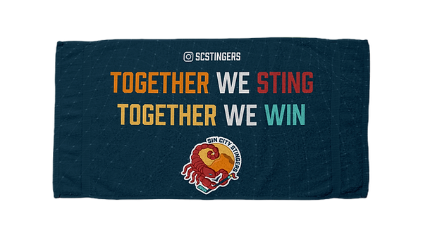
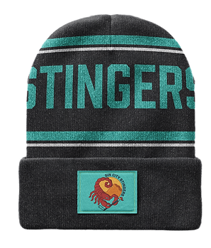

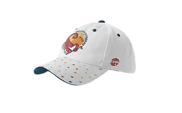
Swag Package
The swag package consists of :
-
Shirts
-
Sweater
-
Hoodie
-
Hats
-
Beanie
-
Bench Towel
In the initial stages of design, a word mark in a different font was also explored, but it conflicted with established brand identity principles and was later discarded.
The images shown are from the finalized swag package.
Uniform
The uniform consists of :
-
Home Uniform
-
Away Uniform
In the initial stages of design, numerous iterations of the uniform were created; however, they were made within the program and not saved. The finalized home uniform is black, and the finalized away uniform is teal.


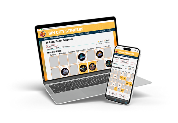
Websites
The website consists of :
-
Home Page
-
Ticket/Schedule Page
-
Community Page
In the initial stages of design, there were contrasting issues with the navigation bar. It wasn't easy to read due to the gold background. Usability is the core focus of websites, so to combat this accessibility issue, it was later changed to navy.

First iteration
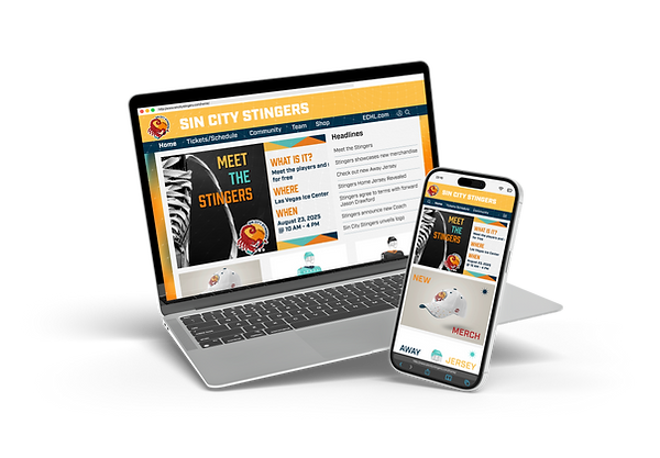

Home Page
Ticket/Schedule Page
Community Page
References
The 12 deadliest animals in Nevada. (2024, August 12). WorldAtlas. https://www.worldatlas.com/animals/the-12-deadliest-animals-in-nevada.html
Ahmed, H. (2024, November 22). The power of lines in graphic design: Structure, movement, and emotion. LinkedIn. https://www.linkedin.com/pulse/power-lines-graphic-design-structure-movement-emotion-hossain-ahmed-ny7mc/
Ali, H. (2014, October 28). Deciphering shape psychology for graphic design. Zillion Designs. https://www.zilliondesigns.com/blog/shape-psychology-for-graphic-design/
Asif, S. (2025, February 9). Mastering the art of sports brand logos a startup’s guide to design psychology and success. https://alitestar.com/blog/design/15/mastering-the-art-of-sports-brand-logos-a-startup%E2%80%99s-guide-to-design-psychology-and-success
Barron, B. (2019, October 21). 7 great ways to come up with a memorable sports team name. ThemeBoy. https://www.themeboy.com/blog/how-to-come-up-with-a-memorable-sports-team-name/
Elliot, E. (2023, October 25). Understanding badge logos: A guide with examples. https://vipmarketing.com/blog/badge-logos-explained-with-examples/
Faustino, A. (2025, March 31). How to narrow your target audience for better sales. https://capforge.com/post/how-to-narrow-your-target-audience-for-better-sales/
Logo animation tips – How to elevate your brand with an animated logo. (2024, June 7). Envato. https://elements.envato.com/learn/animated-logo-tips
O’Connor, D. (2019, November 10). The meaning of shapes in design. White River Design. https://www.whiteriverdesign.com/meaning-shapes-design/
Prpic, N. (2024, March 25). 15 brand tone of voice examples to help you find yours. Filestage. https://filestage.io/blog/brand-tone-of-voice-examples/
Schroeder, E. (2019, July 3). Brands that are totally killing it with voice, tone & style (and how you can, too). Medium. https://uxdesign.cc/brands-that-are-totally-killing-it-with-voice-tone-style-and-how-you-can-too-47792613b267
van Braam, H. (n.d.). Meaning and effects of colors: A psychological perspective. Color Psychology. https://www.colorpsychology.org/