COMPETENCIES ACQUIRED
About this section
Competencies Acquired
This page contains concepts and programs that I have learned throughout my MDMFA program that I believe will benefit my professional career. Each section will answer what the concept/program is, how I mastered it, and how it will benefit me in the future.
Design Research
Regarding design, research involves gathering information to gain a deeper understanding of the business, industry, competitors, markets, and audiences. Research influences design decisions to make a more effective design.
Constant practice throughout the course helped me improve my research skills as the months progressed. The annotated bibliographies also helped because they made me sit and think about the sources I chose to see if they were good or not.
Learning design research is essential to my growth as a graphic designer because it helps me create work that’s both visually strong and strategically informed. By understanding the audience, the problem, and the context, I can make design choices that are more meaningful, purposeful, and effective in achieving real-world goals.

The Client
Figuring out the client's actual needs and how to communicate with them is something learned throughout this course. By listening to the client, asking questions, researching, and collaborating with them, the true needs can be narrowed down.
The thesis definitely helped solidify in my brain that the needs are the most important thing and should be the forefront of every design decision. By constantly practicing it and getting soft feedback reminders from professors and peers, I became competent.
I want to work in an agency and have clients. Because I have learned how to communicate effectively with them and foster a collaborative environment, I feel confident that I can identify their needs and deliver a design that meets their expectations.

The client's need for the thesis was to focus on the audience's need for affiliation. By using a tagline that promotes a sense of togetherness, that need was met.
Brand vs Logo
The entire concept of branding and understanding that a brand is not just a logo. A logo is a way that people recognize a brand; however, a brand is how the product/service makes the audience feel.
Reading The Brand Gap as the textbook for this month helped significantly in grasping this concept. The Pepperidge Farm case study demonstrated how the brand was perceived by women and the narrative that emerged from it. By reading and studying these items, I was able to understand this concept fully.
Understanding the difference between a brand and a logo helps me design with greater purpose. It allows me to go beyond creating a single mark and contribute to the overall identity and experience of a brand, making my work more strategic, cohesive, and impactful.

Instead of just using the logo to display the brand, a tagline was added, with the color palette used for each word. Audiences will associate the tagline and colors with the brand and not just the logo.
Brand Strategy
A brand strategy is a plan designed to achieve long-term goals. It helps a brand make design decisions to achieve its business purposes. It allows the brand to seem consistent and trustworthy in the audience's eyes. A strategy provides direction, allows the brand to remain relevant, stays customer-centric, and aligns with market trends.
Brand strategy was admittedly one of the more complex concepts for me to grasp. It took some external research for it to become ingrained in my mind, as well as regular practice of creating vision boards for various brands. I utilized what I learned on my design Instagram page, and with that extra practice, it started to make sense.
Understanding brand strategy helps me design with intention. It ensures my work reflects a brand’s values, speaks to the right audience, and contributes to a larger, long-term vision—making me a more strategic and valuable designer.

The Sin City Stingers' brand vision board serves as a visual tool to communicate the brand's identity, values, and personality. Elements from the vision board will serve as a reference point in brand strategy.
Features & Benefits
A feature typically describes the functionality of the product or service. It explains its use and what it does. A benefit is consumer-focused and emphasizes how a product or service can improve a user's life.
I initially didn't notice a difference between the two, but once it was pointed out, it became pretty obvious.
I took some time to review ads in various places and media to identify the features and benefits and observe how the company utilized them.
Understanding the differences between the two was essential because it influences my design choices to communicate value through visuals.
This also helps me become a stronger partner to marketing or advertising teams and be seen as more than just a designer—someone who can contribute to the overall strategy.
This is an advertisement created for Effective Copywriting.
Features:
-
Rescuing Dogs
-
Rehabilitating Dogs
-
Providing Care to Dogs
Benefits:
-
The customer makes a direct impact on the dogs
-
The customer gives the dog a second chance.
-
The customer can feel better knowing they made a difference.

Writing Ad Copy
Ad copywriting is different than regular writing. It is persuasive marketing messaging that grabs the reader's attention, features strong call-to-actions, compelling body copy, and can elicit the desired response from the reader.
A great deal of practice was required to master this writing style. I learned I tend to write passively, and writing persuasively took some time to learn. Research into marketing and advertising techniques was necessary, as well as reading Advertising Concepts & Copy.
Mastering skills in writing ad copy was important to me because I wanted my work to be more strategic and persuasive. Design can grab attention, but the words guide the audience to take action. Understanding this made my design more impactful through the choice of words I used. I also believe it gives me a competitive edge and helps me stand out more.

This is an ad created for Effective Copywriting. The body copy was written through several drafts. Its goal is to encourage the reader to visit the website and make a donation.
Brand Voice & Tone
Brand voice describes the brand/company's personality and should remain consistent.
Brand tone refers to the emotional nuance applied to the brand voice, which varies depending on the context or the situation.
A significant amount of research has been conducted to understand this concept. While I was able to grasp the difference between voice and tone, I initially struggled with identifying a brand’s voice and applying it effectively. The exercise of defining what a brand is and is not was especially helpful in deepening my understanding. Practicing this technique with real-world brands significantly improved my ability to recognize brand voice.
Although it was challenging at first, understanding brand voice and tone proved essential for my future as a graphic designer. These elements shape how a brand communicates and how it is perceived emotionally by its audience. If the voice and tone are inconsistent or misaligned, they can alienate the audience and weaken the brand’s impact. As a designer, it's my role to translate the brand’s personality, values, and voice into compelling visuals—so a clear and consistent voice is key to creating effective, cohesive design work
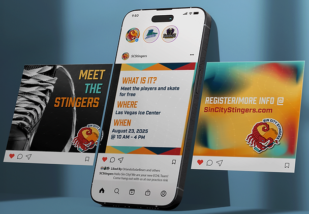
The Sin City Stingers' voice is always passionate, inclusive, and bold.
The caption of the Instagram post shows that the team is welcoming and encouraging a community.
Typography
Typography refers to the arrangement of letters and text to ensure that everything is both legible and visually appealing to the reader. It requires choices that include typefaces, font families, font size, leading, tracking, kerning, and hierarchy. There is also psychology behind different typefaces to consider as well.
Coming into this course, I had a basic understanding of typography, the psychology behind certain fonts, and the accessibility issues that arise when the wrong font is chosen. However, there was a lot I did not know. The LinkedIn Learning videos were very beneficial, and I watched the entire course, not just the required content. The textbook Fundamentals of Typography was also a significant help in my understanding.
Understanding typography is crucial for creating clear, engaging, and emotionally evocative designs. It helps me communicate brand personality, guide the viewer’s attention, and ensure every message is both readable and impactful. As it is one of the design fundamentals, mastering it can only help set me apart from others in a professional setting. My work will benefit greatly from having a solid background in typography.
Three different fonts were chosen for this poster. The first one is intended to be a display font that grabs the reader's attention. The secondary font is informative, it lets the reader know when the activity is taking place. And the tertiary font is meant to invoke a feeling of authority in the quote.

Art vs Design
Art is a form of expression, while design focuses on solving problems. Art is personal, and design is purposeful. Every decision made in design should have a well-researched reason behind it. However, in art, it's often acceptable to rely solely on intuition.
Constant practice and feedback from my peers and instructors help me incorporate this thought process into my workflow, especially during the thesis. I have also started applying that thought process to my personal projects. The repetition has made it easy to adopt the mindset of "design is purposeful and needs a rationale."
Understanding the difference between art and design helps me create work that is both visually engaging and purposeful, with a strategic focus on communicating, influencing, and solving real-world problems. With this knowledge, I can ensure that everything I do is supported by research rather than personal preference. In the future, I believe this will help me stand out in a professional setting because I will have the reasoning behind every decision.

For the Sin City Stingers, every decision, including the logo, was made with research-backed reasoning.
After Effects
After Effects is an Adobe program used to create motion graphics, it can animate anything, add visual effects, and much more.
Prior to this course, I opened After Effects maybe twice. It always seemed daunting, and I was a bit nervous to use it. After following a bunch of tutorials that explained how to set up my Illustrator files and then how to set up After Effects, I was able to create a logo animation.
Learning Adobe After Effects will expand my ability to create dynamic and engaging visual content. It allows me to bring static designs to life, enhance storytelling, and meet the growing demand for motion graphics in today’s digital landscape.

InDesign
InDesign is an Adobe desktop publishing and page layout program. It's used to create multi-page documents such as magazines, newspapers, brochures, and books. People also use it to make presentations.
I last used InDesign a decade ago in my high school newspaper class. At first, I thought it would be easy to figure out, but I realized I remembered nothing.
I had to watch numerous tutorials to figure out how to do even the simplest tasks in InDesign. The more we used it, the better I got at it. Now I know significantly more than when I started out.
If I choose to pursue the editorial design path or focus more on print, mastering InDesign would be essential. I believe even knowing the basics makes me seem more well-rounded.

This spread is from the brand playbook for the Sin City Stingers. It was created in InDesign where I was able to look at two pages at a time.
Premiere Pro
Premiere Pro is a video editing software from Adobe. It can be used to create both long-form content, such as YouTube videos and films, and short-form content for social media posts. Users can enhance their projects by adding text, images, special effects, color corrections, and graphics.
I had never used Premiere Pro before this course, so, like the other programs, I relied heavily on tutorials. Since we had to make a video at the end of each month, I gradually learned the basics.
Lately, everything that catches people's attention has been short videos. Video content is a major part of social media and modern communication in general. Learning Adobe Premiere Pro will help me create compelling video content, expanding my design skills beyond static visuals.

This is a screenshot of a Premiere Pro composition used to create the YouTube video at the beginning of the "Thesis Project" page.
Taglines
A tagline is a short phrase that captures the essence of a brand, product, or service. The tagline also serves as a clarifier if the brand's name is obscure. Taglines can help increase brand recognition while simultaneously portraying the brand's values. A memorable tagline may lead to a consumer purchasing one brand over another.
When choosing a tagline for the Sin City Stingers, my first attempt fell short because it didn’t accurately reflect the brand’s values. I realized I had overlooked the core purpose of a tagline, to communicate the essence of the brand. Through research, reflection, and multiple revisions, I developed a tagline that aligned with the team’s identity and resonated with its audience.
Understanding taglines is important to me as a future graphic designer because they distill a brand’s identity and values into a few powerful words. I've learned that when a tagline is clear and aligned, it provides direction for the entire visual system. Knowing how to interpret and support a tagline through design will help me create more cohesive, meaningful work and allow me to contribute more strategically to brand development in the future.

The Sin City Stingers' tagline.
This is the social media header.
Shape Psychology
Shape psychology refers to how different gemoetric forms can evoke specific emoions and associates with audiences. It can influence perception and behavior.
Early on in the thesis project, we had to figure out the look and feel of our brand. Through my research, I discovered the concept of shape psychology. I browsed numerous websites that discussed the psychology of shapes and examined various real-world examples, as well as the emotions those brands were aiming for. After researching and connecting the psychology to real-world examples, I feel confident in this concept.
Understanding shape psychology will help me design more intentionally and connect with audiences on a deeper level. By using shapes that align with a brand’s tone and message, I can create visuals that not only look good but also feel right, making my work more impactful and emotionally engaging.
